KOALA CONNECTION
KoalaConnection is the most fun and colorful destination for art prints on the internet. The collection is as quirky as it is high-quality, whether minimalist or bold and vibrant, each design adds just the right amount of flair to any space. For KoalaConnection, a unique Logo was developed to reflect the playful and vibrant nature of the brand.
KoalaConnection is the most fun and colorful destination for art prints on the internet. The collection is as quirky as it is high-quality, whether minimalist or bold and vibrant, each design adds just the right amount of flair to any space. For KoalaConnection, a unique Logo was developed to reflect the playful and vibrant nature of the brand.
KOALA CONNECTION
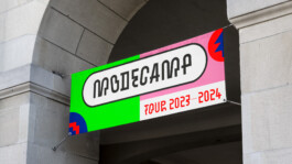
MODECAMP
Modecamp offers visitors the opportunity to customize their own clothing, creating an interactive and creative space where fashion and craftsmanship come to life. Set up in various locations, the camp enables participants to engage with simple design methods to upcycle, personalize, and elevate their fashion. Over four days, visitors experience a unique and inspiring environment, guided by young fashion designers. For Modecamp, a vibrant, bold, and fresh visual identity was developed to match the energy of the event. The design includes a custom headline typeface that supports the DIY spirit.
Art Direction: Arne Meyer, David Turner
Design: Arne Meyer, David Turner
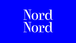
Animation: Nord Nord
Modecamp offers visitors the opportunity to customize their own clothing, creating an interactive and creative space where fashion and craftsmanship come to life. Set up in various locations, the camp enables participants to engage with simple design methods to upcycle, personalize, and elevate their fashion. Over four days, visitors experience a unique and inspiring environment, guided by young fashion designers. For Modecamp, a vibrant, bold, and fresh visual identity was developed to match the energy of the event. The design includes a custom headline typeface that supports the DIY spirit.
Art Direction: Arne Meyer, David Turner
Design: Arne Meyer, David Turner
Animation: Nord Nord
MODECAMP
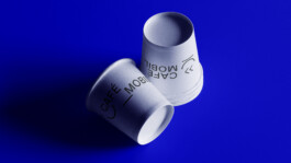
CAFE MOBIL
Cafe Mobil provides professional coffee catering for events. The company offers skilled baristas, high-quality espresso machines and unique mobile coffee stations for rent.
For Cafe Mobil, a logo was designed that not only evokes a friendly and modern feel but also reflects the concept of mobile coffee preparation. With a flexible design approach, the logo adapts to various formats while capturing the essence of convenience and mobility, aligning with Cafe Mobil's core offering and making it easily recognizable at every event.
Art Direction: Giacomo Reichl, David Turner
Design: Giacomo Reichl, David Turner
Animation: Nord Nord
CAFE MOBIL
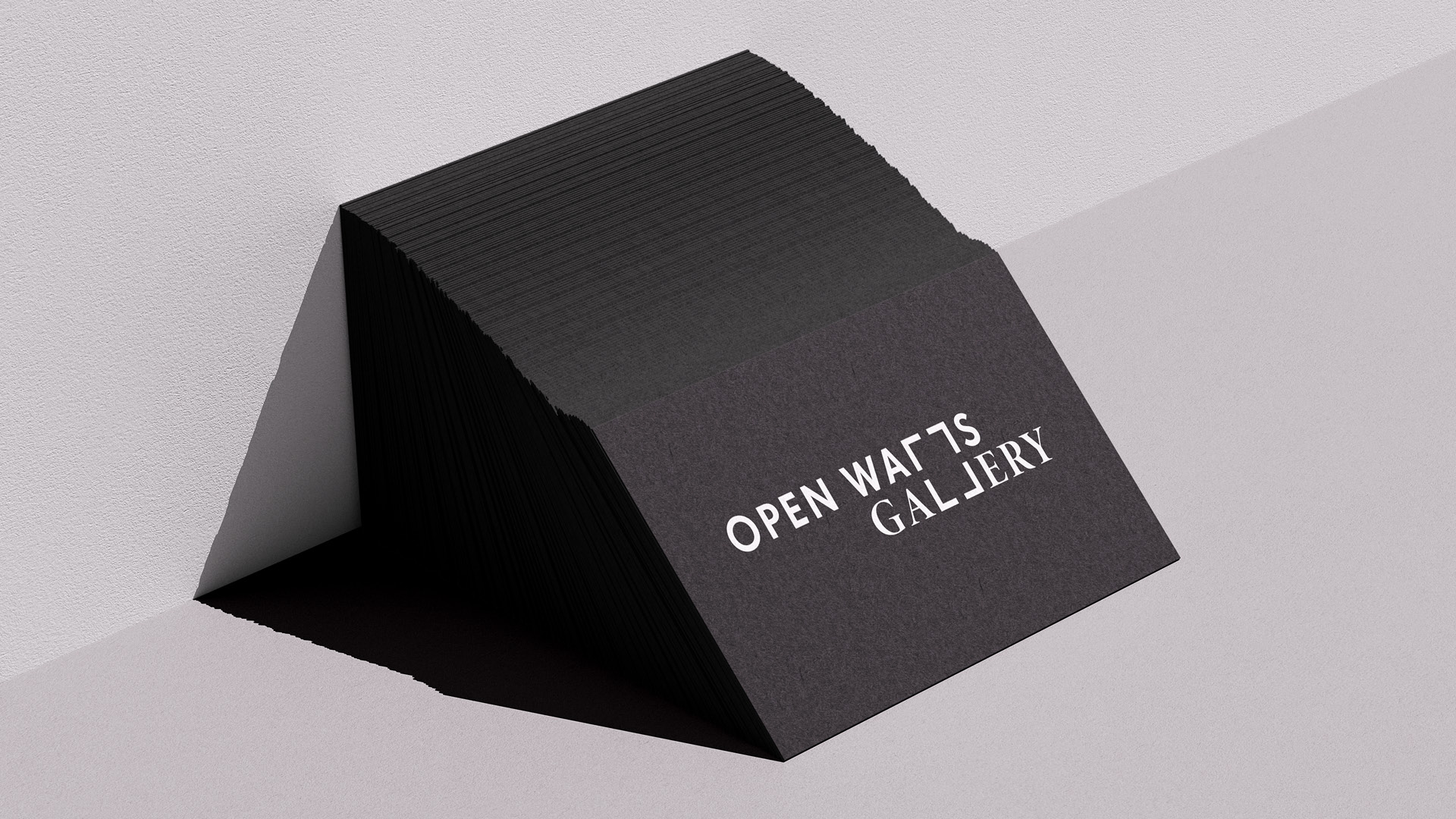
OPEN WALLS
Emerging from the iconic West Berlin Gallery and the legendary Stattbad Berlin, OPEN WALLS Gallery was founded as a unique space to promote street art.
For open walls, a flexible wordmark was created that works as a frame while also evoking the style of stencil artworks. This adaptable design reflects the gallery’s dynamic approach to urban art, allowing the identity to evolve while maintaining a strong visual connection to the street art culture.
Animation: Nord Nord
OPEN WALLS
WILDPARK
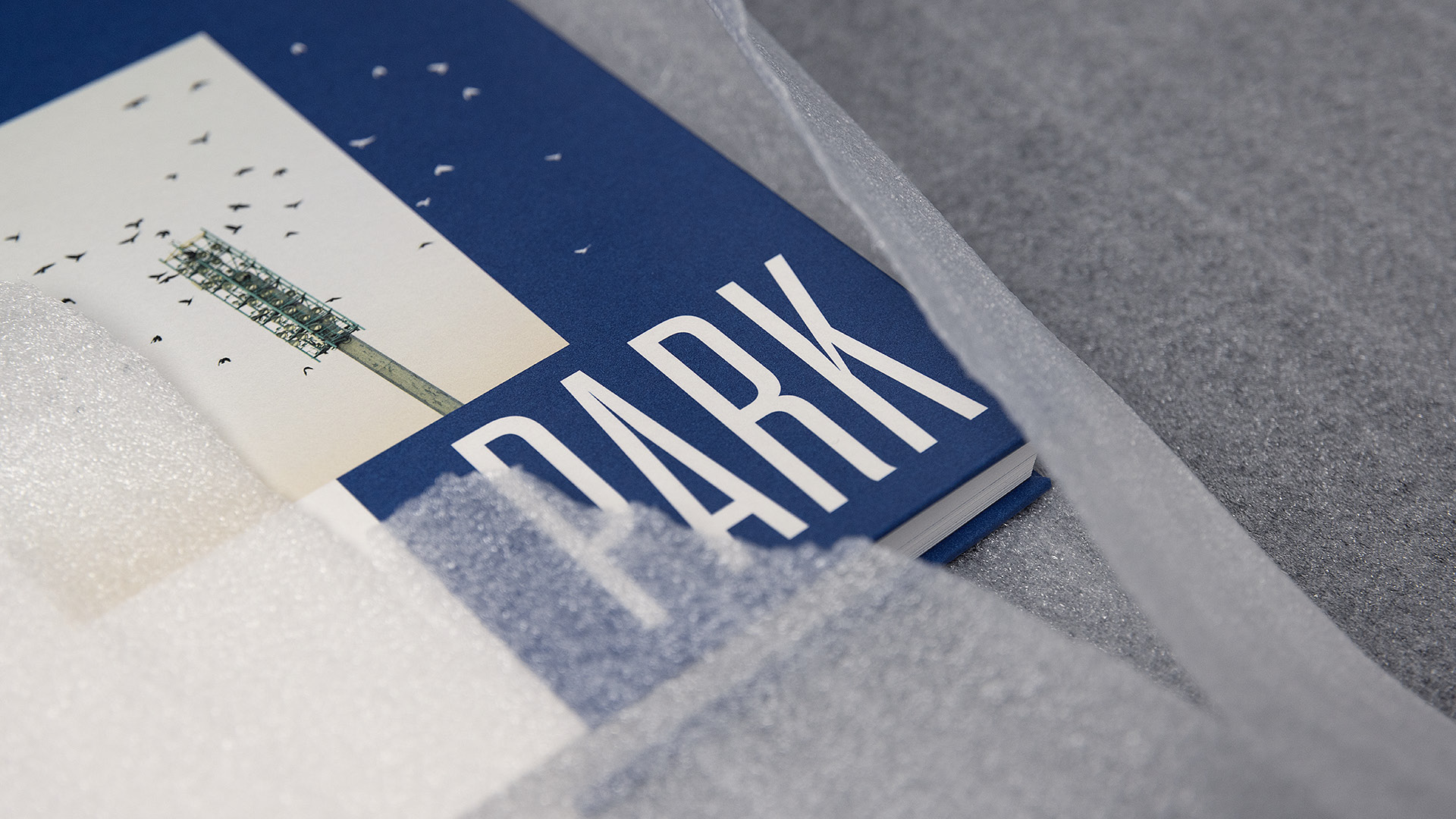
Marvin Ibo Güngör’s photobook Wildpark documents the stadium of Karlsruher SC over several years, capturing its atmosphere, transformation, and the deep emotional connection between the club, its fans, and the venue. The book offers insights that go beyond the usual perspective, revealing moments and details that might otherwise go unnoticed. More than just a photographic documentation, it serves as a lasting memory of the stadium and its significance for those who have experienced it.
Marvin Ibo Güngör’s photobook Wildpark documents the stadium of Karlsruher SC over several years, capturing its atmosphere, transformation, and the deep emotional connection between the club, its fans, and the venue. The book offers insights that go beyond the usual perspective, revealing moments and details that might otherwise go unnoticed. More than just a photographic documentation, it serves as a lasting memory of the stadium and its significance for those who have experienced it.
WILDPARK
HAFVEN ADAPTER
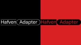
Hafven Adapter is a Sans Serif typeface, that emerged from the idea of combining elements of an American grotesque with a Swiss grotesque, highlighting distinctive features from both styles. The result is a versatile and modern typeface that captures the essence of collaboration and flexibility, while offering a cohesive identity for the coworking space. By incorporating flexible, modular elements, the design adapts to a variety of applications, reflecting the ever-evolving nature of Hafven’s community.
Hafven Adapter is a Sans Serif typeface, that emerged from the idea of combining elements of an American grotesque with a Swiss grotesque, highlighting distinctive features from both styles. The result is a versatile and modern typeface that captures the essence of collaboration and flexibility, while offering a cohesive identity for the coworking space. By incorporating flexible, modular elements, the design adapts to a variety of applications, reflecting the ever-evolving nature of Hafven’s community.
HAFVEN ADAPTER
NORD NORD GROTESK
NN Grotesk is a grotesque typeface that initially appears to be a monospace, though it is not. The concept behind the design was to create a calm and balanced appearance while also incorporating dynamic movements within the letterforms. By combining these two elements, NN Grotesk achieves a unique visual rhythm—quiet and stable at first glance, yet subtly energetic upon closer inspection.
NN Grotesk is a grotesque typeface that initially appears to be a monospace, though it is not. The concept behind the design was to create a calm and balanced appearance while also incorporating dynamic movements within the letterforms. By combining these two elements, NN Grotesk achieves a unique visual rhythm—quiet and stable at first glance, yet subtly energetic upon closer inspection.
NORD NORD GROTESK
VANDALS IN PARIS
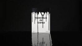
Photographer Thomas von Wittich and journalist Antoine Flandrin have documented the Parisian graffiti scene, capturing the essence of its artists and their work. Their publication presents 35 graffiti artists, offering insights into their creations and personal backgrounds. The bilingual English-French format ensures accessibility for a wider audience, making the publication both an artistic and documentary statement on urban creativity.
Photographer Thomas von Wittich and journalist Antoine Flandrin have documented the Parisian graffiti scene, capturing the essence of its artists and their work. Their publication presents 35 graffiti artists, offering insights into their creations and personal backgrounds. The bilingual English-French format ensures accessibility for a wider audience, making the publication both an artistic and documentary statement on urban creativity.
VANDALS IN PARIS
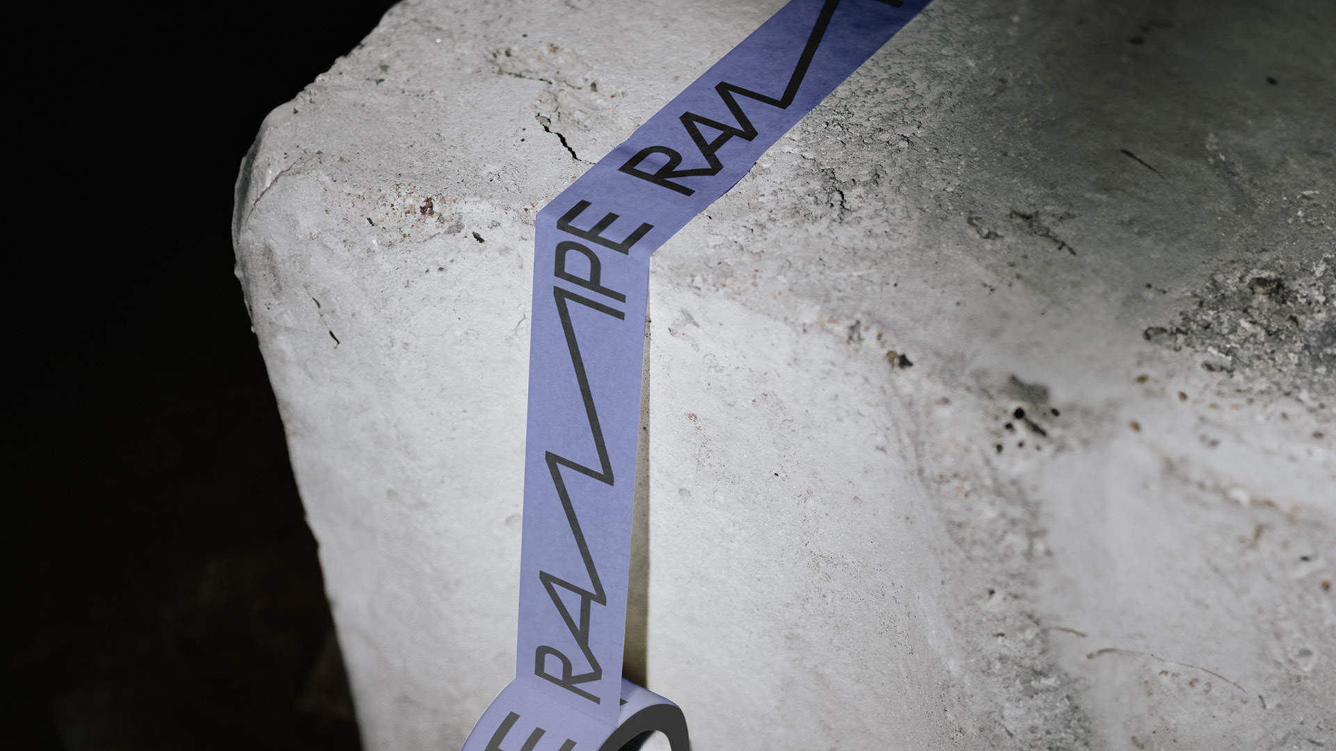
RAMPE
Rampe is a coworking space and community for professionals in the music industry, offering three key workspaces: an office, a music production area, and a digital platform. Open to all music genres, it fosters collaboration through workshops, idea exchange, and mutual support. The flexible visual identity was developed with a central focus on the logo. Its adaptability allows seamless use across various formats, from digital to print. The design reflects the collaborative and creative nature of sound.
Art direction: Giacomo Reichl, David Turner
Design: Giacomo Reichl, David Turner
Animation: Nord Nord
RAMPE
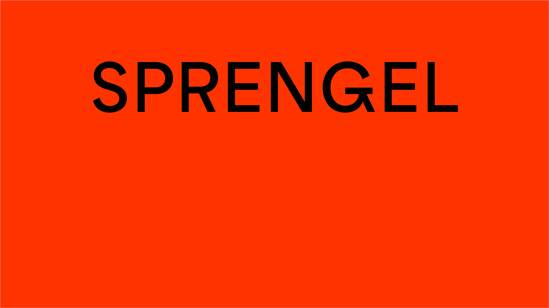
SPRENGEL MUSEUM
For the Sprengel Museum, a custom typeface was developed, inspired by Kurt Schwitters‘ Ursonate and the question of how sounds can be visually represented. This typographic experiment delves into the intersection of language and visual art, translating auditory experiences into a graphic form.
Created in collaboration with Bureau Bordeaux, the typeface draws on Schwitters‘ Archetypes experimental approach while integrating contemporary design principles. It reflects the playful, dynamic nature of sound, bringing a new dimension to the museum‘s visual identity and enhancing its connection to modern art movements.
SPRENGEL MUSEUM
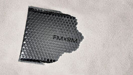
FM × RM
This fashion book accompanies Felix Müller’s spaceflight-inspired collection, capturing its futuristic aesthetics and conceptual depth.
Designed as a set of four individual booklets, each chapter explores a different aspect of the collection. The fragmented format enhances the sense of discovery, mirroring the exploratory nature of space travel. A balance of typography, imagery, and layout choices reflects the collection’s avant-garde spirit, making the book an integral part of the overall artistic vision.
Art direction: Giacomo Reichl
Photography: Norbert Müller
Design: David Turner
FM × RM
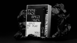
DISPUT DISPLAY
Disput explores the intersection of tradition and experimentation through the creation of a typeface blending elements of blackletter and Fraktur. The design challenges historical conventions while maintaining the structural essence of these typographic styles. To complement the typeface, a carefully crafted box and a set of print products were developed. The box opens from the center, reinforcing a sense of sacred significance and elevating the presentation. Inside, a booklet unfolds in two reading directions, emphasizing the dual nature of the typeface. A CD contains the font file alongside an animation showcasing its dynamic qualities. Additionally, a floppy disk and two T-shirts expand the project’s materiality.
Disput explores the intersection of tradition and experimentation through the creation of a typeface blending elements of blackletter and Fraktur. The design challenges historical conventions while maintaining the structural essence of these typographic styles. To complement the typeface, a carefully crafted box and a set of print products were developed. The box opens from the center, reinforcing a sense of sacred significance and elevating the presentation. Inside, a booklet unfolds in two reading directions, emphasizing the dual nature of the typeface. A CD contains the font file alongside an animation showcasing its dynamic qualities. Additionally, a floppy disk and two T-shirts expand the project’s materiality.
DISPUT DISPLAY